Research
UX Strategy
Information Architecture
UI Design
A/B Test
Prototyping
Company
Rappi
Research
UX Strategy
Information Architecture
UI Design
A/B Test
Prototyping
Company
Rappi
Company
Rappi
Designing a New Revenue Stream Without Touching Checkout
Designing a New Revenue Stream Without Touching Checkout
Most cross-selling strategies happen before customers complete a purchase. This project explored the opposite: how the moments immediately after checkout could become a valuable opportunity for both customers and the business. We transformed an underused feature into a scalable monetization channel that helped users complete forgotten purchases while driving incremental revenue for Rappi.
Scope: Growth, Order Tracking, Cross-selling, Monetization, Research & Experimentation
Cross-functional collaboration: Product, Engineering, Data, Research, Operations, Business, CRM, Catalog, Payments and Monetization
Most cross-selling strategies happen before customers complete a purchase. This project explored the opposite: how the moments immediately after checkout could become a valuable opportunity for both customers and the business. We transformed an underused feature into a scalable monetization channel that helped users complete forgotten purchases while driving incremental revenue for Rappi.
Scope: Growth, Order Tracking, Cross-selling, Monetization, Research & Experimentation
Cross-functional collaboration: Product, Engineering, Data, Research, Operations, Business, CRM, Catalog, Payments and Monetization
Note: UI copy is shown in Spanish, as this product serves Spanish-speaking markets across Latin America.
Note: UI copy is shown in Spanish, as this product
serves Spanish-speaking markets across Latin America.
The Opportunity
Almost everyone has experienced the same situation after placing a grocery order. A few minutes later, they realize they forgot something—a bottle of milk, dessert, toothpaste or pet food. At that point, the only option was to create an entirely new order, often paying an additional delivery fee, or simply postpone the purchase.
We saw an opportunity to capture that existing purchase intent instead of forcing users to start over. The idea was simple: allow customers to place a second order from another store while their original order was still being prepared, combining both deliveries whenever operationally possible. Rather than creating new demand, the feature focused on recovering purchases that would otherwise be lost.
Almost everyone has experienced the same situation after placing a grocery order. A few minutes later, they realize they forgot something—a bottle of milk, dessert, toothpaste or pet food. At that point, the only option was to create an entirely new order, often paying an additional delivery fee, or simply postpone the purchase.
We saw an opportunity to capture that existing purchase intent instead of forcing users to start over. The idea was simple: allow customers to place a second order from another store while their original order was still being prepared, combining both deliveries whenever operationally possible. Rather than creating new demand, the feature focused on recovering purchases that would otherwise be lost.
Why This Mattered
Order Tracking is one of the highest-intent moments in the customer journey. Users have already completed their purchase, trust the platform and remain engaged while waiting for their order to arrive. We believed that this moment could become much more than delivery updates. It had the potential to evolve into a strategic growth surface capable of increasing order frequency without introducing friction into the checkout flow.
Order Tracking is one of the highest-intent moments in the customer journey. Users have already completed their purchase, trust the platform and remain engaged while waiting for their order to arrive. We believed that this moment could become much more than delivery updates. It had the potential to evolve into a strategic growth surface capable of increasing order frequency without introducing friction into the checkout flow.
V0: A Hidden Starting Point
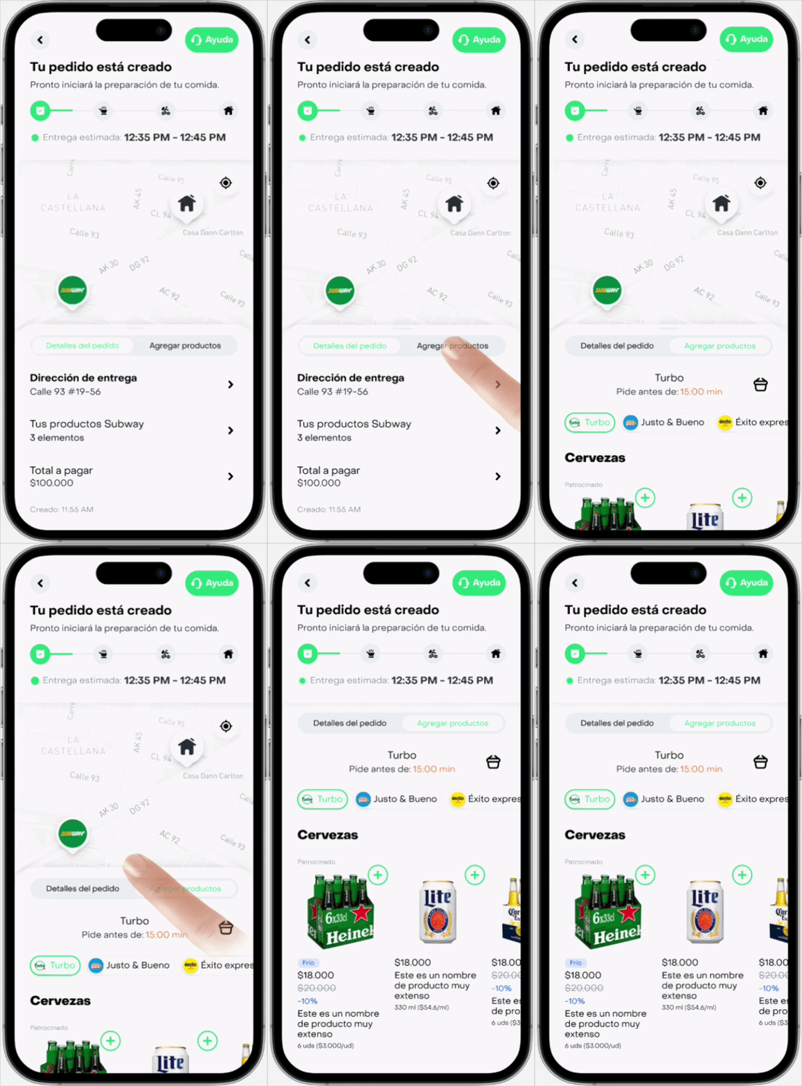
In V0, the feature lived inside a secondary tab called “Add Products.” Users first landed on the order details tab at order tracking and had to actively discover that a second tab existed before they could browse additional products. Although the functionality already solved a real customer need, many users never interacted with it simply because they didn’t know it was there.
This made discoverability the first challenge to solve: the feature wasn’t necessarily hard to use—it was hard to find.
Internally, we called the feature “On Top,” referring to the concept of placing one order on top of another within the same delivery.
In V0, the feature lived inside a secondary tab called “Add Products.” Users first landed on the order details tab at order tracking and had to actively discover that a second tab existed before they could browse additional products. Although the functionality already solved a real customer need, many users never interacted with it simply because they didn’t know it was there.
This made discoverability the first challenge to solve: the feature wasn’t necessarily hard to use—it was hard to find.
Internally, we called the feature “On Top,” referring to the concept of placing one order on top of another within the same delivery.
Instead of jumping directly into a redesign, we started with a small experiment to validate whether discoverability was the real issue.
Instead of jumping directly into a redesign, we started with a small experiment to validate whether discoverability was the real issue.
Experiment 01: Improving Visibility
We launched an A/B test comparing two entry experiences. In the control group, users landed on the Order Details tab as usual. In the variant, users opened Order Tracking directly on the On Top tab.
The experiment produced exactly what we expected—and something we didn't.
Users who landed directly on On Top created significantly more additional orders, confirming that visibility had a direct impact on adoption. However, we also observed a noticeable increase in customer support contacts related to order information.
The results revealed that the core problem wasn't simply discoverability. Many users struggled to understand the tab-based navigation and became confused about where to find essential information about their original order.
Rather than validating our solution, the experiment uncovered a larger usability issue.
We launched an A/B test comparing two entry experiences. In the control group, users landed on the Order Details tab as usual. In the variant, users opened Order Tracking directly on the On Top tab.
The experiment produced exactly what we expected—and something we didn't.
Users who landed directly on On Top created significantly more additional orders, confirming that visibility had a direct impact on adoption. However, we also observed a noticeable increase in customer support contacts related to order information.
The results revealed that the core problem wasn't simply discoverability. Many users struggled to understand the tab-based navigation and became confused about where to find essential information about their original order.
Rather than validating our solution, the experiment uncovered a larger usability issue.
Rethinking "On Top"
Instead of asking customers to navigate between separate tabs, we redesigned how users accessed the feature into a single continuous scrolling experience. This interaction pattern was already familiar through products people use daily, making the experience feel intuitive without requiring additional learning.
The redesign preserved order details as the primary focus while naturally introducing On Top as the next step in the journey. Users no longer had to discover a hidden navigation pattern—the opportunity appeared organically as they scrolled through the page.
Instead of asking customers to navigate between separate tabs, we redesigned how users accessed the feature into a single continuous scrolling experience. This interaction pattern was already familiar through products people use daily, making the experience feel intuitive without requiring additional learning.
The redesign preserved order details as the primary focus while naturally introducing On Top as the next step in the journey. Users no longer had to discover a hidden navigation pattern—the opportunity appeared organically as they scrolled through the page.

Designing for Discovery
Simply moving the feature wasn't enough. Because customers only had a limited amount of time to add products before their original order entered preparation, communicating urgency became an important part of the experience.
To address this, we introduced a persistent footer that remained visible whenever the On Top section was outside the viewport. The footer displayed a live countdown indicating how much time remained, together with a clear call-to-action that automatically scrolled users to the feature. Once the On Top section became visible, the footer disappeared to reduce visual noise and keep the experience focused.
Inside the component itself, users could browse curated store recommendations and product carousels optimized for their current shopping context.
Simply moving the feature wasn't enough. Because customers only had a limited amount of time to add products before their original order entered preparation, communicating urgency became an important part of the experience.
To address this, we introduced a persistent footer that remained visible whenever the On Top section was outside the viewport. The footer displayed a live countdown indicating how much time remained, together with a clear call-to-action that automatically scrolled users to the feature. Once the On Top section became visible, the footer disappeared to reduce visual noise and keep the experience focused.
Inside the component itself, users could browse curated store recommendations and product carousels optimized for their current shopping context.

Experiment 02: Increasing Relevance
Following the redesign, we continued experimenting with ways to make the feature feel even more relevant.
Our second A/B test introduced two changes. First, we replaced the generic illustration shown in the sticky footer with real products based on each country's best-selling On Top items. Displaying recognizable products was intended to trigger forgotten shopping needs more effectively than abstract imagery.
Following the redesign, we continued experimenting with ways to make the feature feel even more relevant.
Our second A/B test introduced two changes. First, we replaced the generic illustration shown in the sticky footer with real products based on each country's best-selling On Top items. Displaying recognizable products was intended to trigger forgotten shopping needs more effectively than abstract imagery.

Second, we implemented a one-time automatic scroll animation. The first time users opened Order Tracking for a new order, the page gently scrolled to the On Top section after a short delay, helping customers discover its new location without requiring manual exploration. This behavior only happened once per order to avoid becoming intrusive during future visits.
Both improvements generated positive results and were eventually rolled out to all users.
Second, we implemented a one-time automatic scroll animation. The first time users opened Order Tracking for a new order, the page gently scrolled to the On Top section after a short delay, helping customers discover its new location without requiring manual exploration. This behavior only happened once per order to avoid becoming intrusive during future visits.
Both improvements generated positive results and were eventually rolled out to all users.
Rebranding a Feature Users Didn't Understand
As adoption grew, another challenge became evident. While "On Top" made perfect sense internally, customers rarely understood what the name represented.
Instead of making that decision internally, we involved users directly in the process. More than 107,000 customers across Mexico and Colombia participated in a large-scale naming study comparing different concepts inside the real product experience.
The research revealed something particularly interesting. Users rarely described the feature in terms of logistics or cost savings. Instead, they naturally framed the experience as simply adding another order.
This insight fundamentally changed how we thought about communication. Rather than emphasizing operational complexity, the winning concepts focused on the benefit users immediately understood. "2-in-1 delivery" consistently outperformed more technical alternatives because it communicated the value proposition instantly.
As adoption grew, another challenge became evident. While "On Top" made perfect sense internally, customers rarely understood what the name represented.
Instead of making that decision internally, we involved users directly in the process. More than 107,000 customers across Mexico and Colombia participated in a large-scale naming study comparing different concepts inside the real product experience.
The research revealed something particularly interesting. Users rarely described the feature in terms of logistics or cost savings. Instead, they naturally framed the experience as simply adding another order.
This insight fundamentally changed how we thought about communication. Rather than emphasizing operational complexity, the winning concepts focused on the benefit users immediately understood. "2-in-1 delivery" consistently outperformed more technical alternatives because it communicated the value proposition instantly.
Impact
The redesign transformed an underused feature into one of the platform's most valuable post-purchase growth initiatives.
The experience continues to generate approximately $40,000 USD in incremental monthly revenue, while reaching a historical peak equivalent to 2.8% of all Rappi orders. More importantly, the project demonstrated that Order Tracking could evolve beyond a transactional screen into a meaningful acquisition and monetization surface.
The redesign transformed an underused feature into one of the platform's most valuable post-purchase growth initiatives.
The experience continues to generate approximately $40,000 USD in incremental monthly revenue, while reaching a historical peak equivalent to 2.8% of all Rappi orders. More importantly, the project demonstrated that Order Tracking could evolve beyond a transactional screen into a meaningful acquisition and monetization surface.
Looking Beyond
While improving discoverability significantly increased adoption, we identified an even larger opportunity for the future.
Working alongside product, engineering and business stakeholders, we defined a long-term vision focused on making On Top increasingly personalized and context-aware. The roadmap included AI-powered product recommendations based on each customer's shopping behavior, purchase history and real-time context, dynamic merchandising by location and time of day, expansion into restaurant orders, bundled pre-orders, unified tracking for combined deliveries, map-based recommendations and new monetization placements for strategic partners.
The long-term objective was to increase On Top's contribution from 1.89% to 6% of all Rappi orders, turning it into one of the company's largest incremental growth channels.
While improving discoverability significantly increased adoption, we identified an even larger opportunity for the future.
Working alongside product, engineering and business stakeholders, we defined a long-term vision focused on making On Top increasingly personalized and context-aware. The roadmap included AI-powered product recommendations based on each customer's shopping behavior, purchase history and real-time context, dynamic merchandising by location and time of day, expansion into restaurant orders, bundled pre-orders, unified tracking for combined deliveries, map-based recommendations and new monetization placements for strategic partners.
The long-term objective was to increase On Top's contribution from 1.89% to 6% of all Rappi orders, turning it into one of the company's largest incremental growth channels.
What I Learned
This project reinforced an idea that has shaped the way I approach product design ever since: Sometimes the greatest impact comes from helping users discover value that already exists. In this case, the most important outcome wasn't redesigning an interface, it was uncovering how thoughtful experimentation, iterative design and continuous learning could transform an overlooked screen into a meaningful driver of business growth.
This project reinforced an idea that has shaped the way I approach product design ever since: Sometimes the greatest impact comes from helping users discover value that already exists. In this case, the most important outcome wasn't redesigning an interface, it was uncovering how thoughtful experimentation, iterative design and continuous learning could transform an overlooked screen into a meaningful driver of business growth.